MOBILE APP DESIGN
NY Digital ID
Prototype
UI/UX
Interaction Design
Mobile
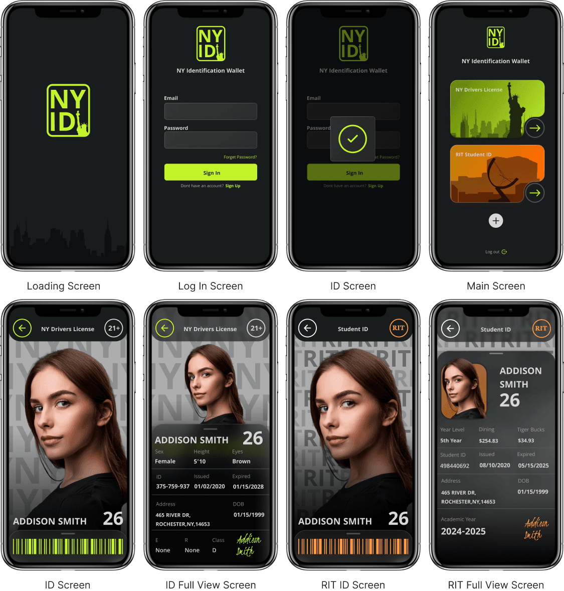
Designed a Mobile ID app that enables users to securely store and access their identification on their phones.
Timeline
10 weeks
Software
Figma
Created
Spring 2025

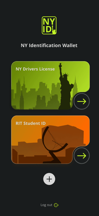

Overview
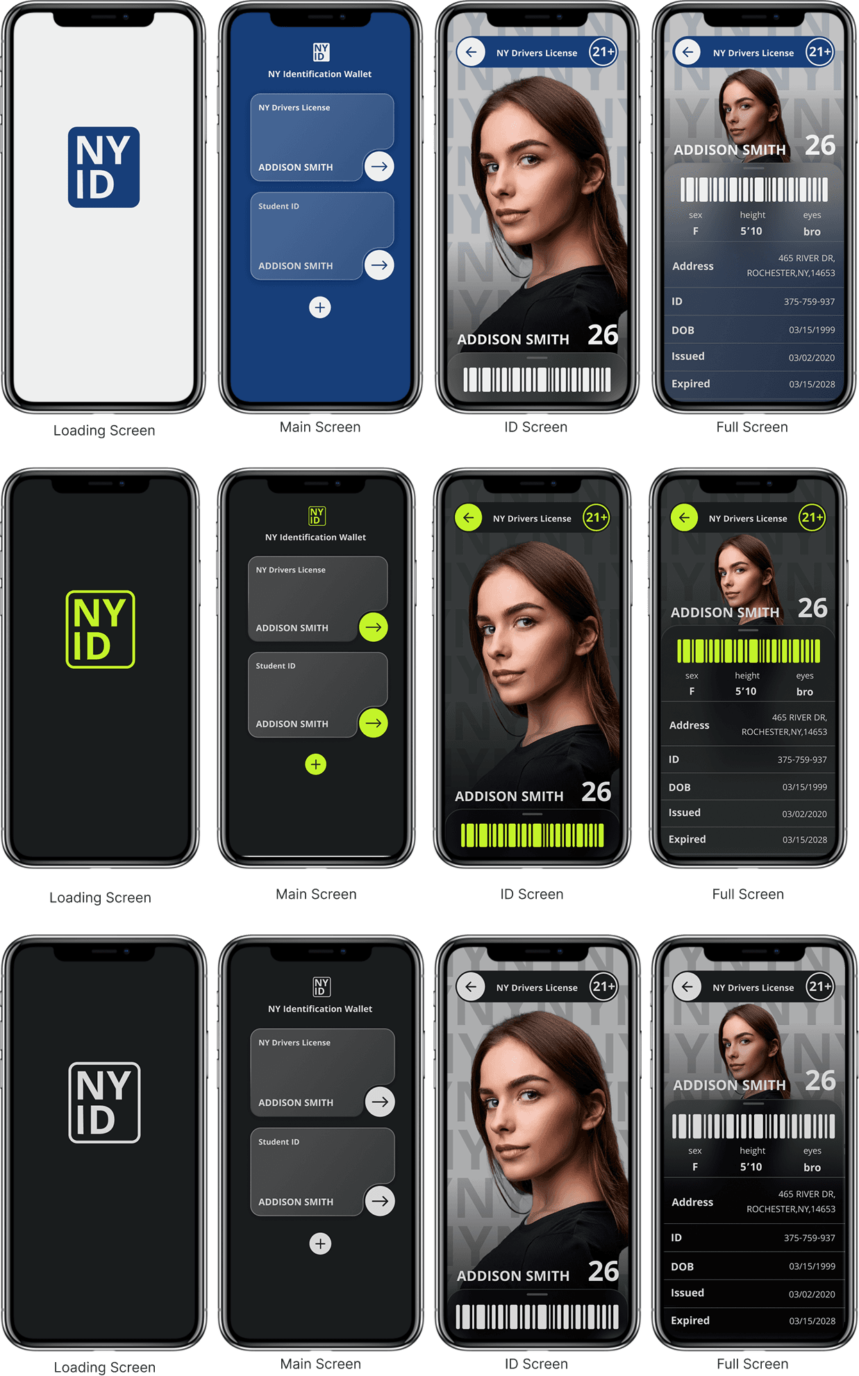
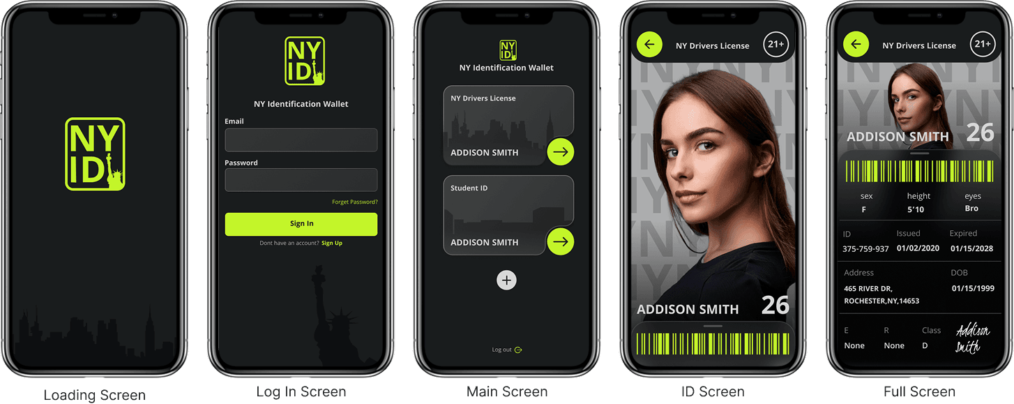
The NY Digital License app securely stores personal identification in one place, eliminating the need for physical cards. It offers a convenient, modern way to access your driver’s license, work, or school ID directly from your phone.
View Prototype
Approach
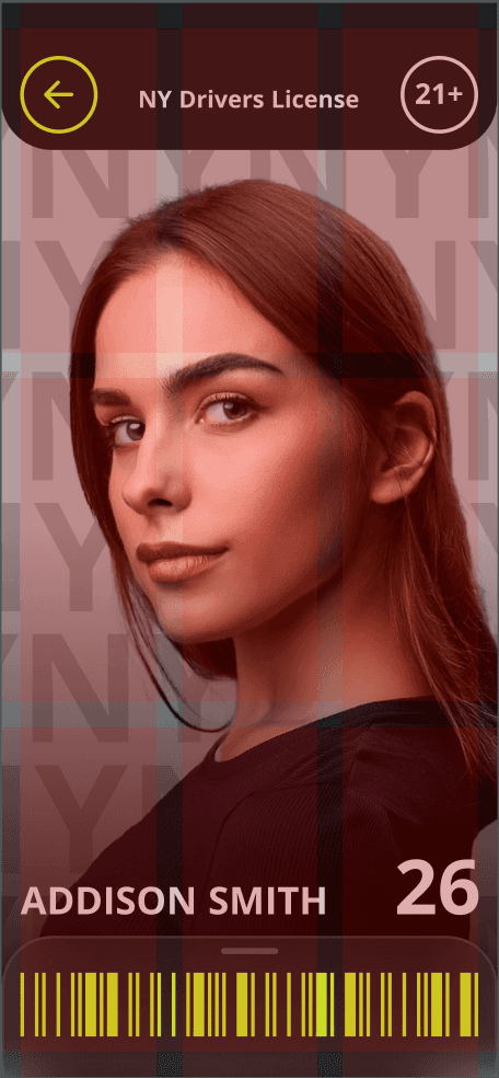
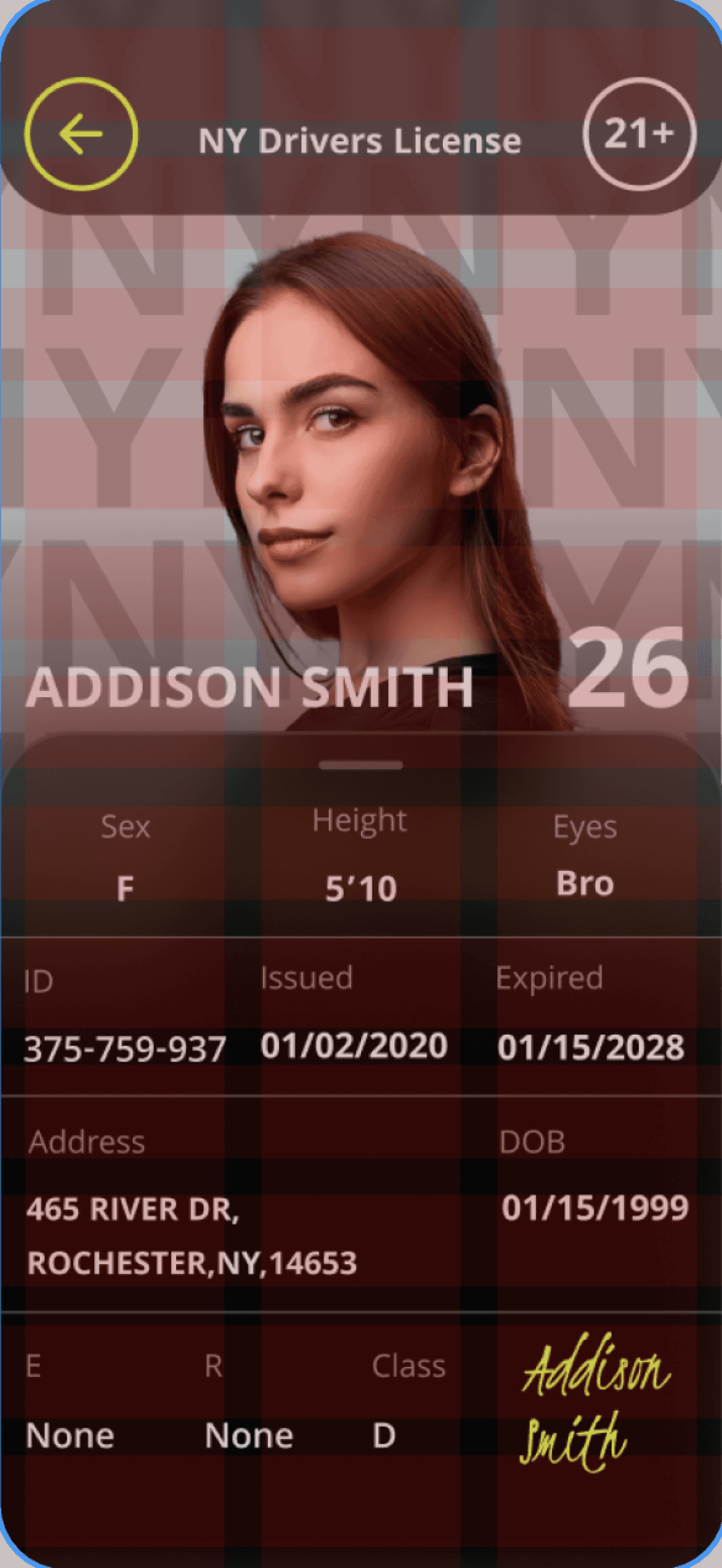
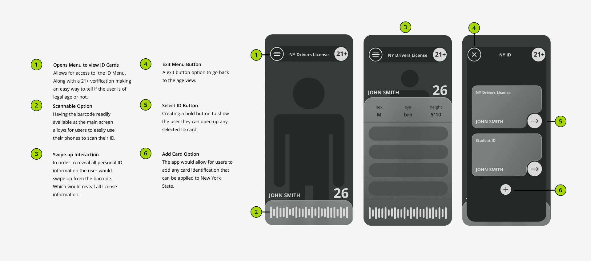
For this project, my approach focused on designing an interface that’s both secure and effortless to use in everyday situations. I aimed to create a system that prioritizes user privacy while offering quick access to essential features like age verification. Users can easily select and scan their ID using a barcode at the bottom of the screen without exposing unnecessary personal information. The result is a smooth, intuitive experience built for convenience and security.

Solving the Problem
I set out to improve the experience of digital ID apps by moving beyond the limitations of physical card design. By creating a more flexible layout, simplifying navigation, and prioritizing accessibility, I aimed to make the interface secure, intuitive, and easy to use in daily life.


Overview
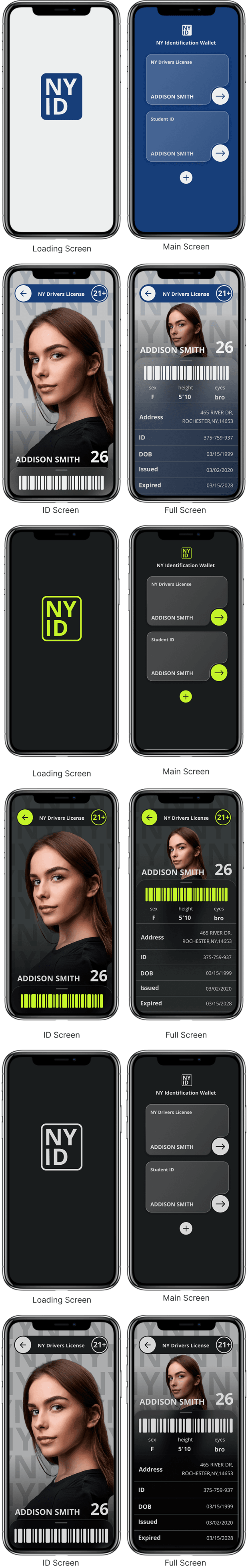
This project gave me a clear outlook on Figma and prototyping. Focusing on micro animations and how they help enhance the prototype even more.
The Process and Challenges
Iterations were a key part in finding the right style and layout of this concept. It helped me understand what elements worked in my design and what didn't.
What I Learned
I learned that both layout and animation play a crucial role in creating a refined experience. Incorporating subtle, seamless micro animations elevated my design, making it feel more dynamic, engaging, and professional.